Thursday, April 5, 2007

Based on Derain's "Grove"

I really like Andre Derain's bathers. Looking through all of the Derains I could find, this painting intrigued me. His version is a bit more purple (which I couldn't seem to match) all over which makes it somewhat weird. I put a slight purple glaze over it, but really didn't dare mess with it too much. Actually, the scanner has darkened it up so that it looks more like a night scene. Before scanning it is definitely more dayish. I like the rhythm of the earth and boulders, and the shapes of the tree trunks and branches. I thought this would be easy after Monet and Van Gogh, but it wasn't. I found it difficult to get the right shades. He has an under painting in a pinkish hue, that is quite light in the lower part of the painting, but fairly strong beneath a grey purple sky. Getting the grey purple was difficult, as I didn't have any black or grey. I had to lighten the mixture with white, which one should avoid because it is opaque and you lose the transparency of the glaze, which I wanted to retain.

Technique wise, you will see some fairly smooth blending of colors and shading on the mounds and some of the tree trunks. I appear to have forgotton the main one. This is a vast improvement over my initial attempts to blend with acrylic. Medium helps, and I use a second brush damp with water to brush out the transition. I also use thin glazes, so I build up the color slowly. I hope this will enable better portraits.

Monday, April 2, 2007

Inspired by Van Gogh, "The Huts"


When I was drawing I was interested in faces. I didn't care that much for landscapes. They weren't challenging, they didn't have the emotional impact of portraits and figure drawing. They didn't work very well with the broad pastel chalks. I though Van Gogh would however, but still had minimal interest in doing one. With paint many things change. Landscapes can be very challenging, getting the colors right is a big deal, adapting to the very different styles of painters also huge. Trying to copy Van Gogh and Cezanne can be very difficult. While these don't have the impact of Picasso's "absinthe drinker", they do have great beauty. Ultimately, besides the challenge, I did this because I think it is wonderfully beautiful. And of course some of the beauty is the feeling of simple village life that it inspires. So it is not without emotion. I hope you enjoy looking at it.

Friday, March 30, 2007

Inspired by Cezanne. Mt St. Victoire

From the too strong vibrant colors of Matisse to the subtle almost pastel colors of Cezanne. There are many shades of purple, violet, and blue in the background. These "cool" colors make the eye think distance. The foreground is reserved for warm colors yellow, red brown, and the middle has the cooler greens and yellow/greens of foliage. Cezanne does very little to create a sense of volume. He primarily uses cool colors to push back and warm colors to bring forward. So looking at it one can just see lots of splashes of color and not really see why they are there. Eventually hills and creases in the mountain appear and a many colored mass becomes a tree. Cezanne may be looking at a scene and figuring how to break it into its many colors, but I may only see the many colors and not be able to piece it back together. I have no idea what he was doing with the sky. In particular the right top corner looks as though he is viewing a mountain in the distance. This doesn't make sense both from his perspective and because I don't think there are higher mountains near St. Victoire. (Near no. But the alps begin 60 to 100 miles away and could be viewed on exceptionally clear days. There are view points of Mt St. Vitoire to the southwest that might allow a view of the alps off the shoulders of Mt. St. Vitoire.) Anyway, I tried to emulate what he had done. Eventually I realized the blue lines were ridge lines and worked at them as such. I tend to get lost just putting dabs of color on in the many places where the object is not obvious. The colors are so light that they must be put on as thin washes. Many require toning down with white which is why the overall impression is pastel like. Most pastels have so much chalk mixed with the pigment that you don't get strong pure colors. Mixing white with paint to get lighter tones does the same thing.

Thursday, March 29, 2007

Based on Matisse's "Luxumbourg Gardens"

This is about the most electrically colorful painting I've seen. Matisse has used color compliments in places like the leaves of the tree (it may be fall but one wonders) and the sunny parts of the oval trees. I thought they were boulders when I first looked at it. The road in the foreground is hardly recognizable due to the shadows which he has made deep purple. He has placed yellow the color compliment of purple next to it which makes them both more alive. There is red-orange on one side and it's compliment blue green on the other side of the painting. There is bluish red and it's opposite yellow green. Lots of fun to look at, tricky to mix the colors. I blew the curve in the road having early on painted over my guide lines. I got lost in the colors and forgot the structure. It could be fixed, but this is all about colors so I'm just going to enjoy it for the present.

Monday, March 26, 2007

Based on Picasso, "Person resting on elbow"

The scan is a little darker than my original. The black/burnt umber background is painted over a reddish Sienna on the left and the greenish yellow oxide on the right. These show thru slightly in Picasso's original and in my copy. There are undercoats of black/burnt umber and some of the reddish sienna, and even a touch of drybrushing of the red over the green skin tone.

My apologies, I don't know when Picasso painted this.

Sunday, March 25, 2007

Based on Derain's "Bathers"

Several Expressionists did paintings of bathers. This one could have been Matisse, or Picasso later on. It absolutely stunned me. It was painted by Andre Derain, in 1908. I had not read about him before. I particularly liked two or three of the sixteen paintings I looked at finding several so-so. But I think this one is awesome. It is tricky to copy, because it has many washes or very thin glazes, I believe. It seemed to me that using washes was the trick, but then you get drying lines, unless you wet the paper, which I didn't think of. If you try to do it all opaque, then I guess you can dry brush the tints on later or try to wash them on. I found glazes of acrylic medium too thick. Most of the colors to the figures I applied first before the main skin tone. I did some washes later. Getting the many tones of the background blues and greens was even more difficult, here is where the brush strokes show the most.

In this case my scanner is not staying true to the colors. The right side is dark blue green, but the green does not show in this copy even when you double click and view it up close.

Saturday, March 24, 2007

Based on Van Gogh's Olive Trees

This isn't real close, but then again maybe it doesn't need to be. It is an exercise in color and brush strokes. Paint with just medium while a nice glaze is not thin enough to flow well, water must be added. The colors here are brighter than the computer printout that I was using, I prefer the bright colors, and remember that many of Van Gogh's paintings are quite bright.

Friday, March 23, 2007

Based on Renoir's "Girls at the Piano"

This painting could certainly use more work, but then it seems the more I do the worse it gets. It was pretty good at the first brush stroke. It would be quite effective to drawn in all the shading and creases of the dress, then use a transparent glaze for the dress. I did this and it looked good, but not enough detail. Then I used two shades of the light purple for the dress and that too looked good, but with less detail. Then I added grey paint and glaze, and white paint and various renditions of those. The blue snuck in inadvertently, it was hiding in the white.

This painting is one of a series done by Renoir with the same subject, indeed I think the same girls. They were painted in the 1889 - 1892 time frame, I'm not sure exactly which year, after the Expressionist movement had fallen apart. Renoir was going for Beauty and he, at least, got it.

This is the first time I've used medium. In this case it was matt medium, it is pure acrylic and allows dilution of the color, better brushwork, although it was still too thick at times, and good glazing. At times the glaze paint although colored, barely covered the original coat. The matt medium dries with a semi-gloss finish. My first paintings dried very flat and chalky. It may have been due to the quality of the paint, but also probably due to diluting with water.

I'm intrigued by mediums and glazing. Part of the mystique of oil paints is their transparency. Titian is said to have put on as many as 30 glazes of thin transparent paint, resulting in wonderful effects that I can only guess at, but presumably translucency and depth among them. Acrylics would allow you to do something similar in days instead of months. Mediums also allow you to get watercolor effects, but with complete control of the flow of color and with permanence when it dries.

Monday, March 19, 2007

Daffodil

Painting of a daffodil based on a photo by Sue Huss. I was trying to get enough texture in the brush stroke so I could then lay in some darker veins via a wash that would then be wiped lightly leaving the veins. Some of the brush strokes show, but it looks like it will take gel additive to get enough texture for that treatment. At the same time, I had the fall back position of using pencil which shows through as veining even though the Cadmium Yellow and Titanium White are dense opaque paints.

Friday, March 16, 2007

Ingrid with some dark wash


The post below explains the source of these images. Here I have added a dark wash to see the effect compared to the graphite drawings below.


Thursday, March 15, 2007

Ingrid


For a while it has occurred to me that the best artists in any age are drawn to the best paying area of endeavor. In the Renaissance painting and sculpture for the Church, in France and England paintings of the aristocrats, in Holland in the seventeenth century, paintings of local color. Since photography and movies the best visual artists probably work in movies. Almost any film has great cinematography that combines good lighting, wonderful landscapes and remarkable poses of made up actors and actresses. So watching films I often wish I could stop the TV and capture the pose I see momentarily. Tonight I had a DVD of "Play it again Sam". It starts with the final scene from "Casablanca". Here are four drawings from that scene where Ingrid opens her mouth in suppressed pain closing her eye, bends her head forward and then Bogart lifts it back up and she looks at him. Wonderfully beautiful! These were more difficult for me to draw, I usually have a hard copy so that I can make measurements in order to keep the scale. Here, I'm totally freehand.


I want to add some wash to these and see how it looks. But they may never look as good as now.


Wednesday, March 14, 2007

Copy of Van Gogh Portrait


A fairly easy drawing to copy, but the challenge comes with getting the multitude of colors in the face close, and matching the background and jacket colors. Part of learning to paint is making up lots of colors, shades, and tints from 6 or 7 basic colors. This took about 1 hour for the drawing, 3 hours in class for most of the painting, and about an hour to finish the outlining of the jacket and a few touch ups on the face. You could keep going and going trying to make it more exact. This seemed to scan a little darker than it looks on paper. The original I worked from was downloaded from somewhere, then printed, and I have scanned it back in, so you can compare mine to what I was working from. The colors look closer to me on paper than here. I can see that in painting, I covered my drawing lines and mangled the man's right shoulder a bit. The original is on top.


Tuesday, March 13, 2007

Based on Van Gogh's "Fisherman"

Based on Van Gogh's painting of a fisherman on a river. I did not try to copy all that exactly. That would require matching paint colors exactly, trying to duplicate paint strokes etc. Probably it would be good to do that to a greater extent, but when copying this I felt that variability and frankly expressionism that conveys the idea is sufficient. As a result I didn't do a particularly good job of replicating the boats or fisherman. I don't think they need to be. This kind of painting is a lot of work. Despite all the randomness, it takes as long as the portrait I just did where I tried to get every detail exact. My brush strokes did not work very effectively for the water. Van Gogh's weren't as good as say Monet. But I didn't want to make this just about water, that is something I'll work on more in the future.

Saturday, March 10, 2007

Estee lauder model finished painting

Having reviewed the drawing and the first stage, I like this better. With a painting things often get worse, sometimes permanently worse, before the final stage. I must have redone the color on the lips 4 times. It was good the first time. The color for the highlights in the hair just didn't flow as well as the raw umber so that didn't go as well as I hoped. But still I think the hair looks better than any hair I've ever done before. The skin was redone several times. The raw sienna didn't have enough red in it. The darker shades did not blend very well so much reworking. Acrylic extender which slows the drying of acrylic paint and practice may help. Paint flow is clearly an issue for hair. Every paint is different. I guess you have to learn what consistency works best. But adding water dilutes the color. What a complicated and fragile process painting is.

Estee Lauder stage 2

I may be too attached, when I can't finish a piece of art without scanning the intermediate stages. I suppose I'm afraid I'll blow it, here at least is a nice piece of art. I planned to start with a very light raw sienna skin tone and add shading, but doing that would probably lose definition around the eyes and nose, so I put down the dark raw umber eyebrows and eye liner. I thought that a wash of raw umber would be a background for the hair on which to lay lighter highlights. But got carried away with the umber brush strokes. Once the first bit of paint is applied the round point brush leaves a nice soft trail that looks like a tress of hair. I think this is a nice portrait just the way it is.

Estee Lauder Model stage 1


Here is the pencil part of pencil and painting. When copying a painting or photo, I draw these nice pencil portraits, and then lose all the detail covering them with paint. I'm beginning to think I should just use a tracing or projection. The challenges with this painting are first the fine skin tone with very subtle shading, next not losing the delicacy of the eyes, nose and mouth, and last acceptable hair. Using pastel it would be easier to keep the detail, and use subtle shading with the skin, however color is limited to the pastels on hand. I posted this to preserve the drawing.

Friday, March 9, 2007

Based on a Pissarro I think


This is my first attempt to copy an impressionist. What is fascinating about this is the high definition in the rock and stone work. Many colors mottled together. This approach is useful for sea clifts, hills and mountains, making them appear much more like the chaotic fractal patterns of rock.

The original has hundreds of little leaves, and debris and sticks scattered on the ground. Part of the difficulty of duplicating this kind of painting is scale. Besides the delicate small scale work of facial features, the leaves and blossums in the distance need to be made small. It is difficult to make paint strokes small enough when working in an 8 in by 10 in format to make the distant leaves appear distant when compared with the foreground. Doing so is critical to get perspective. All the litter on the ground is difficult to paint realistically because it is so small. Once again the face got too dark. I thought I had lightened it, but it seems to have dried darker than it appeared. I can always go back, but every flesh tone mix is different. Update, I did go back and lighten the face a bit.

Thursday, March 8, 2007

Ruben's Portrait of a Child


Ruben did a number of fine portraits, this along with some of his self-portraits struck me as worth copying.

Sunday, February 25, 2007

Practice

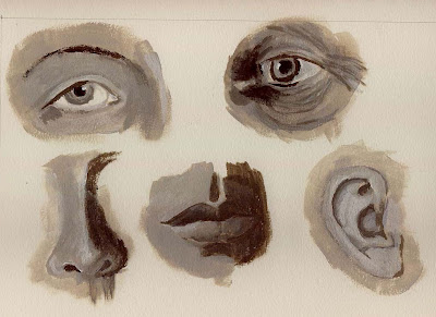
I've been frustrated by not knowing a thing about painting. Type of brush, quality, shape, size and material all make a difference. Then what do you do with each of them and really how do you do it. Then there is type of paint. I've come to find out that acrylic dries so fast that you can't blend colors or tones together to show contour, shading, or gradual change in skin tones. So, it is time to get some books from the library and do the exercises they suggest. Joseph Dawley published "Character Studies in Oil", 35 years ago. He shows wonderful character study portraits, very finely done on Masonite which appears to allow finer detail than canvas with its rough texture. Anyway, he shows how he goes about painting the parts of the face, hair, and then whole faces. The above are the first five exercises, top right is an old person's eye. He sets up 5 tones, in this case from white to pure raw umber, with 3 intermediate tones which he describes as white with 5%, 10% and 25% raw umber. I think mine were darker. Using these to lay in the various tonal and Shadow characteristics of the eye, mouth, ear etc. he then finishes up with blending to get contours and final touches of highlights and darks. He does his drawing with brushes, starting with very rough forms and refining as he goes. Of course he is using oil, and so he can wait until the last stage to blend. I found that I could get some blending here working in acrylic. If I lay the paint on thick and blend immediately. I think stiff bristle brushes are necessary for blending. There are tricks to be learned.

I also read a book by a woman child portraitist. She demonstrates portraits in charcoal, sanguine, pastel, oil and watercolor of the same child. A real tour de force. Portraits in watercolor probably require the most skill. She said that pastel is the best medium for child portraits because it is so soft. Also, she never sprays (fixative) pastel (she does charcoal ans sanguine I think) because it dulls the color. Pastel must be framed under glass right away, but if so, it keeps its color best. This is great cause I can work in pastel, and paint is tough. Still it is fascinating and hugely challenging world. And the more I explore doing art, the more I come to appreciate art work, and the artists.

Friday, February 23, 2007

Jehova creating the sun and moon


I worked long and hard on this and I think it is pretty awful. The drawing was good, I though to use colored pencils, but they didn't cover very well. The watercolor paper, is not suitable for pastel, so I painted, and lost all the detail, couldn't get the drapery, and had trouble with colors among other things.
Update: I did a little work on it. While the gown is not very good, it shows some hint of drapery and the colors are within the correct range. At least it removes the most glaring flaw. I probably should have left Jehova's hair alone, and maybe the beard too.

Wednesday, February 21, 2007

Mary detail from unknown artist

Once again struggling with shading of skin tone. Teacher said I should be working in oil. Apparently acrylic dries too fast to get smooth transitions in tones. I tried to paint fast with prepared variations of skin tone. Also had trouble with the hair. At this point I can do just as well with pastel and that's not good. While the original has rosy cheeks, chin, and nose, most of the rest of the face is more tan than I was able to get. Going back to fix things at this point would likely make it worse, since acrylic dries darker than when wet, so it would be very hard to mix appropriate colors.

Tuesday, February 20, 2007

Original Picasso "Girl with Pitcher"

Why is this so beautiful? Tonality and overall softness contribute a lot. But I was struck by the flow of curves. Note the outer line of the face curves continue on to define the eye lid and eye socket. The eyebrow continues smoothly into the nose line. The left shoulder, arm, hand line continues into the right forearm. This is some of Picasso's rhythmic flow. Even though he outlines, he keeps it soft, so that the curves, range of colors, tones, and muted outlines convey a very gentle, sweet, mood. He does this while hinting at early cubism with his treatment of the nose.

Based on Picasso's "Girl with a Pitcher"

As I've whined before, my printer only prints in monochrome, in this case it was magenta. This helps me with value (how light or dark) but not at all with color. Since I don't paint in front of the image on the computer, I have to guess. In this case I put some swatches of close pastel on a sheet of paper and winged it from there. I was amazed how close I got, with the exception of the pitcher and bowl. The more muted colors of the vase in the original add to the overall softness of it. I'll post it above.

Monday, February 19, 2007

Ramana Maharshi

The best known saint/sage of India during the twentieth century. I did a grey scale drawing of him a few days ago that you can see on my pastel site. Here I'm struggling with shades of paint, blending etc. I find brushwork less refined than pencil, shading harder, and because of the quick drying time of acrylics, color matching and blending difficult.

Sunday, February 18, 2007

Original - Pieter Pauwel Rubens

My audience of one insists that I post the originals. I feel my paintings look better without the comparison. My early drawings looked good with the comparison because I got quite close with simple drawings, and I was proud of that, but painting is a whole different situation.

This is a portrait of the Duke of Lerna. It hangs in the Museo del Prado in Spain. The original is 283 cm x 200 cm which explains why Rubens has a little better command of the details than my 7 inch painting. Unfortunately, I started mine as a sketch from a monochrome copy that had been cut off at the top and bottom and so missed some of the composition. It was on only 50# paper, but I decided to paint it in rather than use pastel. This piece is magnificent. Double click to see the detail.

Ruben's Horse

I really like Rubens. Among the many drawings I looked at, his appealed to me more than any others. I felt that Durer was a better technician, but that Rubens had more artistic flair. His paintings get pretty wild. I love this portrait. Presumably the guy was military, so his portrait surrounds him with his horse and battle scene. Rubens uses this same horse in another portrait. I like the horse more than the man. But the portrait is more than the wonderful horse, there are the dark roiling clouds of war, the small cannon fodder soldiers, the dark overhanging leaves. Quite sinister, which may say a lot about the man, but the horse is a white light of innocence and magnificence in the middle. 2/18/07 actual size 7 in. x 8.5 in.

Thursday, February 15, 2007

Original "Visitation" Pietro di Cosimo


This is what real art looks like. Feast your eyes.

Picasso "Sisterhood"


I called this "Sisterhood". When I began to look at depictions of "Visitation" the meeting between Elizabeth and Mary, I noticed a great similarity with Picasso's drawing. The story on the drawing is that the woman on the left is wearing a hat from a VD hospital for women in Paris (early 1900's). The woman on the right has a baby and is pregnant. Two widely separated paths through life, but they are joined by compassion. One thinks, "there but for the grace of God go I", but I don't see even this much judgement in Picasso's work, just pure understanding compassion. Indeed, from God's perspective it is just, "there go I". Which applies to both. I did this drawing 9/3/06.

Wednesday, February 14, 2007

Visitation based on Pietro di Cosimo


My project for todays painting class. I chose visitation because it reminds me of the Picaso drawing I called sisterhood. I think Picaso had "Visitation" in mind when he did that drawing of a pregnant women carrying a baby and a prostitute. The pose is quite similar, you can see my copy on my drawing web site, linked above. 2/014/07

Jehova creating Adam


Well this is my first acrylic painting. Fitting that it should return to the subject of my first drawing. Drawing and pastel seem much easier and more exact. Shading with paint seems much more difficult, and getting the drapery look always difficult, much more so with paint. On the other hand color saturation is stronger, lines are in the natural colors instead of pencil lines. This will take some getting used to. 2/13/07

Saturday, February 10, 2007

First Still Life


My first painting. 2/07/07. Here I'm using tube watercolor as opaque paint. I like the total coverage, the black background, and the ability to put any color esp. white over the black. You can double click on the picture to get a large version.